(800) 728 8391


Quick summary:
- Your real estate logo should show who you are and what you stand for.
- Simple design and strong typography make you easier to recognize.
- Consistency across your website, listings and social media builds trust.
- Once your logo is ready, a professional website turns recognition into opportunities.
Top real estate logos successfully connect a business with what it does. They help people understand who you are, set you apart from competitors and stay in their memory.
Your logo is a core visual element of your brand identity. It shows up everywhere your real estate company appears, on your website, listings, signs, social profiles and more.
“A good logo should be able to convey all the intangible qualities that make up the essence of the company (vision, mission, values and culture)“.
– Quote from The International Conference on Economics and Business
When designing real estate logo, you’re shaping how your brand is perceived from the start. Whether you’re creating your first logo or rebranding, the goal is to present a clear and professional image.
In this guide, we’re sharing the best real estate logos to inspire your own, with practical tips and insights into what makes a logo stand out.
6 Features of effective real estate logos
There are many directions you can take your real estate logo. You might go modern and bold, or keep things classic and understated. It all comes down to how you want your brand to feel.
Even with different styles, the best logos tend to have key things in common. They follow a few simple design guidelines that make them easy to recognize and remember.
1. Distinctive design
Unique real estate logos are one of a kind. An original logo helps your brand stand out in a crowded market. The right mix of fonts, spacing and layout gives your logo its own identity.
2. Memorability
Great logos communicate fast and stick in people’s minds, like a catchy song.
65%
People remember 65% of visual content after three days, compared to just 10% of written information.
Source: “Brain Rules” by John Medina
3. Simplicity
Simple real estate logos are easier to recognize and reuse. Most global logos rely on clean layouts and one or two main colors.
34%
Among the top 100 companies, black is the most popular logo color, used by 34% of brands.
Source: logo.com
4. Relevance to your brand
For agents working in real estate, your name carries your reputation. When the logo puts the name first, people remember it more easily and pass it along in referrals.
5. Timelessness
A timeless logo stays effective year after year. Design trends come and go, so it’s safer to stick to timeless design principles to ensure your brand avoids feeling dated.
6. Consistency across channels
Your logo needs to work everywhere your business shows up. A well-designed logo looks great on your homepage, landing pages, social media and printed marketing materials, regardless of the size.
68%
of companies report that brand consistency has increased their revenue growth by 10-20%.
Source: Brand Consistency Report by Marq
How to create real estate logos?
There are a few ways you can create a logo for a real estate business: design it yourself, use an AI tool to generate one or simply hire a specialist to do it for you.
Each option comes with different levels of cost, effort and control.
Create logo yourself
If you’re early in your business, creating your own logo can save you money. You don’t need anything complex to look professional, just be creative.
Tools like Canva, Looka, Tailor Brands and Adobe Express let you design a clean, name-based logo without design experience. You can pick a layout, adjust fonts and colors and add your name or brand element.
This works best when you keep the design simple. Focus on clear typography and one or two colors. You can always improve the logo later as your brand grows.
Generate a logo with AI
Another way to create your real estate logo is to use AI logo generators. These tools give you speed and inspiration while staying relatively affordable. You can generate dozens of logo ideas in just a few minutes.
Popular AI tools include Looka, Brandmark, LogoMakr, Hatchful by Shopify and Canva’s AI logo generator. You usually answer a few questions about your business, then the tool creates logo concepts based on your input.
If you find a design you like, you can use it as is or treat it as a starting point. Small tweaks will make the logo feel more personal and less generic.
Hire a freelancer or agency
The third option is to hire a designer to create your logo for you. This gives you access to experience and a fresh perspective on your brand, including ideas you might not think of on your own.
A designer takes your brand direction and turns it into visual choices, like typography, layout and the use of negative space. This is often how modern real estate logos achieve a clean, confident look.
Graphic designers also understand how people react to different colors and shapes. The result is a logo that feels intentional and works well across your marketing assets.
The downside is cost. Hiring a freelancer typically starts at a few hundred dollars, while agencies can charge anywhere from a few thousand dollars and up, depending on scope and experience.
>> Also read: 12 Real Estate Agent Tax Deductions to Save More
Best real estate agent logos
If you’re a solo agent or Realtor, your brand usually comes down to two things: your name and your face. These are what people remember and look for when they’re ready to reach out.
When it comes to logos, your name tends to work better than your photo. A well-designed name-based logo is easier to repeat and easier to use.
Strong typography plays a big role here. The right font and layout can make a name feel established and professional.
The examples below show how simple design choices create a clear, pro presence.
1. Sarah Patterson
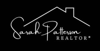
Sarah Patterson’s logo clearly centers on her name, with a simple house roof line placed above it. The script-style typography adds a personal, approachable feel, while the roof outline immediately signals real estate.
The black-and-white color scheme keeps the logo clean and versatile, making it easy to use across a website, listings and marketing materials. The layout keeps the name readable, with the symbol acting as a subtle supporting element.
Pro tip: A calligraphic wordmark can add personality and a human touch to your brand. This works well if you want your logo to feel personal and relationship-driven.
2. Kristofor Carnegie
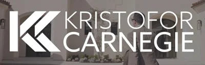
Kristofor Carnegie uses a logo built around a bold “KC” monogram, paired with clean, modern typography. The geometric letterform feels confident and structured, while the full name stays clear and readable. The mark works especially well in small spaces, like profile images or browser tabs.
Pro tip: For places with very limited space, like a website favicon, a simple symbol works extremely well. Your mark stays recognizable even at small sizes, which makes the site easy to spot among multiple open tabs.
3. Carlos Cumber
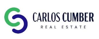
With Carlos Cumber’s logo, the name takes priority and is supported by a simple, modern symbol. The abstract mark forms a stylized “C,” which connects directly to the name without pulling attention away from it.
The blue and green color scheme feels calm and professional, while the typography keeps the name easy to read across different formats. The symbol adds a visual anchor that works well alongside the text.
4. Sean Hettich

Sean Hettich’s branding is built around recognition. His name, along with his face, shows up consistently across his social media, website and email communication, which makes the brand feel familiar over time.
People tend to remember faces, especially when they see them repeatedly. Keeping the logo name close to the photo helps connect the face with the name, so there’s no confusion when someone wants to look him up or reach out.
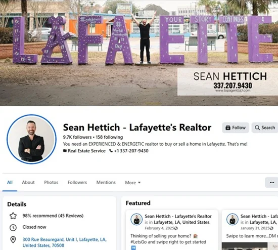
The clean typography keeps everything easy to read and puts full focus on the company name. This works especially well in a local, relationship-driven market, where trust and familiarity matter most.
Best real estate brokerage logos
Real estate team logos need to represent more than one person. They must scale across the brokerage, offices, listings and client facing materials, supporting brand consistency across teams and management.
The examples below show how successful brokers balance professionalism, readability and long-term brand recognition.
5. Compass
Compass has built one of the most recognizable brands in the industry. Its mission, to help everyone find their place in the world, comes through clearly in the logo design.
The clean wordmark paired with the compass icon creates a strong link to guidance and direction. The black-and-white color scheme keeps the brand modern and flexible, while the compass mark often appears on its own across social media and mobile apps.
For an established, international real estate agency like Compass, that standalone symbol is enough to signal who they are, even without the name attached.
6. Albertson

Albertson Real Estate operates in South Carolina, serving residential buyers and sellers in areas that include lake and mountain properties. The logo reflects this through simple shapes that resemble peaks and a roof, subtly connecting place and purpose.
The deep blue color reinforces stability, while the clean typography keeps the name easy to read across digital and print materials.
Pro tip: When your market has strong geographic character, abstract shapes can hint at place without making the logo overly literal.
7. NOLA Living Realty
Another good example of a logo that connects to a place is NOLA Living Realty. The design features a stylized city skyline, which ties the brand to real estate and urban living. A small crescent moon adds a subtle local reference to New Orleans, often called the Crescent City.
The logo uses shades of gray paired with blue accents, creating contrast without overpowering the design. Notice the clear typography that keeps the name easy to read, while the graphic elements add context and personality.
Pro tip: Local symbols can strengthen recognition but keep them secondary to the name so the logo stays clear and easy to scale.
8. Lake Life Realty
Lake Life Realty uses a circular badge-style logo that features a lake and shoreline, clearly reflecting the lifestyle and market it serves. The design feels cohesive and easy to recognize, especially at smaller sizes.
The logo works well both on the site and across social media profiles, where the circular shape fits naturally into profile images.
Pro tip: Badge-style logos are perfect for using on social media networks. They stay readable and recognizable even when cropped into small profile icons.
Famous luxury real estate logos
Famous real estate logos for high-end agents were designed to create a certain feeling. They help set expectations around quality, trust and exclusivity. The brands below show how a logo can become the public face of a luxury business without saying too much.
9. Katie McFerrin
McFerrin Real Estate, led by Katie McFerrin, a top 1% real estate agent, leans into luxury through simplicity. The logo features a clean wordmark paired with a minimal, abstract monogram placed above the name, with black and white doing most of the visual work.
Gold plays a key supporting role. It’s not dominant, but it adds a clear sense of quality and value.
90%
Studies show that 90% of first impressions are based on colour.
Pro tip: When choosing the best colors for real estate logos, black and gold are often used in luxury branding to signal exclusivity and high status, helping reinforce a sense of prestige.
10. Josh Flagg
Josh Flagg Los Angeles uses a logo that leans fully into high-end positioning. Josh is one of the most recognizable luxury agents in the US, known for multi-billion-dollar sales and his presence on real estate television.
The neutral color palette and generous spacing give his logo a calm, polished feel. Nothing competes for attention, which works well when the name itself carries weight. This kind of logo lets reputation and recognition do the talking, which fits perfectly in the luxury space.
11. The Oppenheim Group

The Oppenheim Group takes a different path and clearly breaks a few luxury branding rules. Instead of muted tones, the logo centers on a bold, hand-drawn red circle that immediately grabs attention.
Red is rarely used in luxury real estate, but here it works because the brand leans heavily on visibility, media presence and strong personalities. The symbol becomes the main identifier across the brand’s online publications. With typography kept minimal elsewhere, the red mark does most of the recognition work on its own.
>> Further reading: How to Become a Luxury Real Estate Agent? 6 Steps Guide
Real estate logos with names for your inspiration
Logos for real estate with names come in many forms. Sometimes it’s a person’s full name, sometimes a first name paired with descriptive text and sometimes a brand or association name people already recognize. You’ll see this across top-producing agents, founder-led teams, boutique firms and professional groups.
In these cases, the name plays an important role in how the brand is recognized. Let’s look at a few examples.
12. Mincey Homes

Mincey Homes, led by Adam Mincey in the Atlanta metro area, uses a logo built around a bold badge shape with a minimal house outline inside. The geometric lines tie the symbol directly to the brand name.
The logo appears in both black and white versions, depending on the background and use case.
Pro tip: When designing your logo, create at least one additional color version. If one option doesn’t work well in a specific setting, you can switch to another on the go without redesigning everything.
13. Steve Wrobbel Team
Steve Wrobbel Team’s logo is built around a clear “SWT” initial mark paired with a keyhole icon. The symbol connects naturally to real estate, hinting at access and opportunity without overcomplicating the design.
The logo sits on a transparent background, which makes it easy to place across different layouts. Here, we’ve shown it on SWT’s website, where the background is purple.
14. Nick Sells New York
Nick Sells New York uses a logo that turns the brand name into a clear statement. The wording leaves no doubt about who Nick is and where he operates, which makes the brand easy to understand and remember.
The design pairs clean typography with a simple, slightly three-dimensional building icon. The 3D effect adds depth and reinforces the New York focus without taking attention away from the name.
Pro tip: Long, horizontal logos can be harder to use when space is limited. Before committing, think about where your logo will appear and whether it will still be readable in tighter layouts like mobile screens or social profiles.
15. Colorado Association of REALTORS®
The Colorado Association of REALTORS® has a logo that feels welcoming at first glance. The circular symbols bring together urban skylines, the Colorado “C,” and mountain shapes, which instantly connect the brand to the state it represents.
Using several colors works well here because the organization speaks to a wide and diverse community across Colorado. Each color is kept within clear shapes and balanced with neutral typography, so the logo stays friendly, clear and easy to recognize wherever it appears.
Pro tip: If you use a few colors in a logo, give each color a clear role. Structured shapes and neutral text help prevent the design from feeling cluttered.
Top real estate investment company logos
Real estate investment logos are built to convey stability and long-term thinking. Their design choices often focus on structure, balance and professionalism. Here are a couple of innovative examples.
16. Haystack Land Company
At first glance, the Haystack Land Company logo feels grounded and deliberate, which fits an investment-focused brand well. The illustrated haystack and pitchfork point to land ownership, agriculture and long-term value rather than quick transactions.
The monochrome color scheme keeps the logo serious and understated. The hand-drawn illustration adds character without making it feel casual, reinforcing a sense of patience, expertise and focus.
Bravo to the person behind naming and designing this brand – the concept is clear, cohesive and easy to understand.
17. Mashvisor

Mashvisor is a real estate data and analytics platform focused on helping investors make smarter decisions. The logo reflects that purpose right away. The icon blends a location pin with upward graph elements, which clearly points to market analysis and performance tracking.
The blue and gray color palette feels trustworthy and tech-forward, which fits a product built around numbers and research. Clean typography keeps the brand easy to recognize.
Pro tip: For commercial real estate businesses, clarity and credibility matter more than emotional or lifestyle cues.
Best real estate photography logos
Photography businesses understand branding discipline. These examples show how logos can stay simple and unobtrusive while supporting the services.
18. Tyler Plummer Photography
Tyler Plummer Photography leans into a strong personal identity. The circular layout frames a bold monogram, with the founding year included to add credibility and a sense of experience.
The gold and black color palette gives the logo a premium feel. The photographer also uses a one-color version where it makes sense, such as for watermarks, which keeps the logo flexible and consistent.
19. 360 Drone Visuals
360 Drone Visuals’ logo makes it very clear what the business does. The name says it straight away and the drone with the camera lens backs it up visually.
Bold black typography and a strong icon keep the logo easy to read and confident. It gives the impression that the team knows what they’re doing and feels comfortable showing it.
That small pop of color also works well because it’s contained in one place. It adds visual interest and clearly signals a visual service, while the rest of the logo stays simple and confident.
Pro tip: If your service is highly visual, your logo should communicate it. Clear symbols and confident type help people understand what you offer in seconds.
>> Read more: Real Estate Drone Photography: All You Need to Know
Best real estate marketing logos
Marketing teams should know how to market themselves. That’s exactly why it’s worth looking at their logos too. These examples show how brands design logos that work across digital channels.
20. Luxury Level
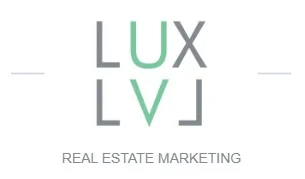
The Luxury Level uses a modern, typographic logo that reflects the balance between the founders’ energy and discipline. The mirrored letter forms create a structured, almost architectural look, which fits a brand focused on quality, consistency and clear direction.
The gray and green color scheme keeps the logo clean and contemporary. Green is often associated with growth, stability and trust. Here, it’s used to reinforce confidence and a focus on long-term results.
Pro tip: If your logo includes a strong accent color, use it consistently across your real estate website, for example, on buttons, links or calls to action. This helps tie your branding together and makes the site feel more cohesive.
21. Collov.ai
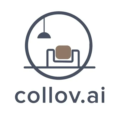
Collov.ai uses a logo that feels modern and product-led. The circular frame and minimal interior scene point to interiors and staging, which fit a brand built around real estate visualization and marketing.
The muted color palette keeps the logo calm and professional, while the simple line work makes it easy to use across web pages, app interface and social media.
The dot-ai ending is integrated naturally into the wordmark, making focus on technology clear and doubling as the domain address.
Pro tip: When choosing the best fonts for real estate logos, pick clean, readable typefaces that match how and where your brand shows up, especially on websites and digital products.
Final thoughts on the best real estate logos
The best real estate branding logos stick in people’s memory. A solid logo needs to be easy to recognize, help people feel confident about who you are and what you do and work well everywhere you show up.
Showing your logo across your website, listings, signs and social profiles helps people recognize you faster and remember your brand.
In RE, a clean logo built around your name does exactly what it should. It supports your reputation and helps people talk about you with confidence.
Once your logo is ready, the next step is putting it to work. That means having a professional website and starting to attract your target audience.
That’s where Placester comes in. With ready-made templates, an AI website builder and resources designed to help agents get online faster, you can launch a professional site without technical hassle.
AI Websites for Real Estate
Get a custom, ready-to-edit website
in less than 4 minutes.
FAQ
What makes a real estate logo effective?
An effective real estate logo is easy to recognize and memorable. It clearly connects your brand to what you do and works well everywhere you show up. Strong real estate names and logos rely on clarity, not decoration.
What logo styles work best for luxury real estate brands?
Luxury brands work best with restrained, confident designs. Elegant real estate logos usually use clean typography, generous spacing and a limited color palette like black, white, or gold. Palm trees are often used in luxury real estate branding to signal coastal living, warmth and an aspirational lifestyle tied to markets like California and Florida.
What mistakes should be avoided in real estate logo design?
The biggest mistake is overcomplicating the design. Many real estate business logos fail because they use too many bright colors, fonts, or symbols that don’t scale well. If your logo doesn’t work at small sizes, it won’t work in real life.
How can I create a real estate logo for free?
You can create free real estate logos using tools like Canva or AI logo generators. Many real estate companies’ logos start this way, especially early on. Stick to a name-based design and keep it simple so it doesn’t look generic.
Where do I find images for real estate logos?
If you need icons or inspiration, start with platforms that offer template real estate logos or royalty-free assets, like Canva’s icon library or SVG repositories.
What is the best color for a REALTOR logo?
The best colors for a REALTOR logo are black, gray, navy and white. They feel smart and timeless, while accents like gold or blue can support luxury or trust.
Are minimalist real estate logos more effective?
Yes, minimalist logos are easier to recognize, easier to reproduce and don’t age over time. That’s why many modern real estate brands keep their logos clean and restrained.
Published on
(Last updated on
)