 (800) 728 8391


Updated on
Top 10 Real Estate Landing Pages: Examples & Tips

Quick summary:
- Real estate landing pages are a very powerful tool for turning traffic into leads. If designed well, they can actually double the conversion rate.
- To build a high-converting real estate landing page, you need to follow some classic UX and SEO tips, but also make sure your page reflects brand trust and value for the visitor—not your business.
- In this article, we’ll cover the best real estate landing page examples and tips on how to build (or optimize) your own.
A landing page has one clear job—to turn a visitor into a prospect.
And if this job is done well, the results can be quite impressive. According to Unbounce’s 2024 Conversion Benchmark Report, a well-designed dedicated landing page converts 65% higher than typical website pages.
Unlike your real estate website’s home page, a landing page is built for a single campaign or purpose, and every element on the page supports that goal.
But how do you do it?
In this post, we’ll look at the 10 best examples of landing pages used in real estate.
We’ll walk you through real-life real estate landing page examples, showing how each one works and why it’s worth adding to your marketing strategy. You’ll also find practical tips to create high-converting landing pages and optimize those that don’t work.
What is a real estate landing page?
A real estate landing page is a dedicated web page built around one clear goal. In their purest form, landing pages are standalone–accessible only through a link in your campaign, not your site’s main navigation. They’re also stripped of distractions like menus, so the visitor has just one path forward: completing the action you’ve set.
The purpose of a landing page is to drive a single call to action (CTA). That could be signing up for alerts or booking a tour. We’ll explore the most common goals later in this article.
In real estate, things can look a little different. Some pages we’ll cover in this article aren’t ‘true’ landing pages in the strictest sense. For example, home search landing pages usually allow users to keep browsing results instead of locking them into a single action.
From a user experience standpoint, this flexibility makes sense even if it bends the classic landing page definition.
8 reasons why real estate landing pages matter
Landing pages are important because they capture attention at the right moment and convert it into leads. The key to a landing page is timing. Someone clicked an ad, opened an email, or followed a link because they were interested in the content. The landing page has to take that exact moment of interest and turn it into action.
That means guiding the visitor to share their contact details so you can move them to the next step in their journey. It’s less about pushing your offer and more about understanding what the website visitor wants and making it easy for them to get it.
Competition in real estate is tough, and getting someone’s attention is only half the battle. What matters most is what happens after the click. That’s where landing pages are important. They give potential buyers, sellers, renters, or recruits a direct path to engage with you.
Here are the benefits of using real estate landing pages.
1. Work with any marketing channel
Real estate landing pages fit seamlessly into any marketing effort. They’re usually tied to a specific audience and campaign, which keeps the message focused.
A real estate lead might click an ad for a property, open an email about an open house, or search for a local guide. The landing page delivers exactly what they came for.

Campaigns always perform better when paired with a focused page. Visitors expect the same message they saw in your ad or email, and that consistency builds trust.
2. Deliver higher conversion rates and better lead quality
A landing page removes the clutter and focuses on a single goal. That’s why it often converts better than a regular website page.
According to Unbounce’s 2024 benchmark report, the average landing page conversion rate across industries is 6.6%. It’s nearly double the average website conversion rate, which hovers around 3%.
Visitors see exactly what they came for, without distractions from the rest of your domain. And this focus makes it easier for them to act.
Better conversions also mean better quality leads. New visitors who fill out a lead capture form on a targeted page are already showing serious interest. They’re ready for your follow-up.
3. Capture leads and grow your email list
Email is still one of the most reliable ways to connect with potential clients and the highest-performing channels in digital marketing.
For every $1 spent on email, businesses get on average $36 of return (Litmus, 2024 data).
A real estate landing page makes growing your list simple.
Incentives encourage visitors to share their details. You can offer something valuable in exchange for a sign-up, like local market reports, property alerts, or homebuyer checklists.
With a larger and more engaged email list, you have a direct channel to nurture leads, share new listings, and stay top of mind.
4. Make campaign results easy to track
One of the biggest advantages of landing pages is how measurable they are. If your real estate landing page has a single goal, tracking its performance is clear-cut.
With Placester, new leads flow directly into your CRM, where you can also see the source they came from. For deeper insights like traffic and behavior, you can connect your site to Google Analytics.
- Conversion rate – percentage of visitors who complete your lead capture form.
- Cost per lead – how much you spend on ads for each contact captured.
- Form completions – raw number of leads generated.
- Bounce rate – percentage of visitors who leave without taking action.
It’s a good practice to review these metrics weekly during a live campaign and monthly for ongoing pages. This way, you’ll catch problems early and see trends over time.
5. Showcase properties in the best light
Dedicated real estate landing pages give each property focused visibility. Instead of competing with dozens of other listings, one page highlights only a single home.
For best results, include key property details, like price, location, and floor plan, so buyers quickly get answers to their first questions.
High-quality visuals are critical elements in the real estate industry marketing. Following current marketing trends, professional photos, virtual tours, and extras like drone footage can bring a property to life online.
The more focused your presentation, the easier it is for potential buyers to picture themselves in the property and take the next step.
Strong examples of CTAs for these types of landing pages are ‘Schedule a Tour‘ or ‘Request More Info.‘
6. Create urgency with time-sensitive offers
Some opportunities in real estate don’t last long, and urgency can be a powerful motivator. Landing pages are the perfect place to use that momentum and turn interest into action.
Marketers often rely on the psychology of scarcity and FOMO (fear of missing out) because people naturally respond to limited-time opportunities. When buyers know a home, incentive, or event is only available for a short window, they’re more likely to act quickly.
Real estate businesses use landing pages to make time-sensitive offers like open houses, buyer incentives, or exclusive pre-sales clear and focused. A visible deadline or countdown then nudges visitors to share their details or schedule a showing right away.
7. Personalize the experience for different audiences
Real estate audiences have very different needs. A first-time buyer, a homeowner considering selling, a luxury buyer, and a prospective renter shouldn’t necessarily see the same message.
Landing pages make it easier to tailor the experience to a specific audience, campaign, location, or intent.
For example, a page promoting a first-time buyer guide can focus on financing and the buying process, while a seller-focused page can emphasize valuation, market conditions, and preparing a home for sale.
Personalization can also extend to smaller elements, such as headlines, images, testimonials, and CTAs. This helps visitors feel that the page is relevant to what they are actually looking for rather than like a generic real estate website.
There’s evidence that this can have a meaningful impact. HubSpot analyzed more than 330,000 calls to action and found that personalized CTAs performed 202% better than basic CTAs.
For real estate businesses, that makes landing pages particularly useful for creating campaign-specific experiences instead of sending every prospect to the same homepage.
8. Build stronger brand recognition
A dedicated landing page gives real estate businesses another opportunity to reinforce their brand and establish a consistent identity across campaigns.
Why?
Because you’re not relying on a generic page but highlighting your unique positioning instead, whether that means expertise in luxury, local, or first-time buyer support.
This is especially valuable when prospects encounter a real estate brand across multiple channels. Consistent visuals, messaging, tone, and positioning help create a more recognizable experience and make the business easier to remember when a prospect is ready to make a decision.
Research from the Journal of Marketing found that brand consistency can strengthen brand performance by helping consumers form clearer and more accessible brand associations. In practice, a landing page gives real estate businesses a controlled environment to reinforce those associations while still tailoring the message to a specific campaign.
10 best real estate landing page examples
Because a landing page is designed to drive one specific action, there are different templates depending on who it’s targeting.
A page aimed at current homeowners or renters will look different from one aimed at buyers or sellers, even if the offer is the same, like a neighborhood guide or report. That’s because each group has different motivations for wanting the resource.
Here are common types of real estate landing pages:
1. Patrick Shino: Real estate agent landing page
Patrick Shino’s realtor landing page on Fulton Grace is a great example of a real estate landing page built around personal branding.
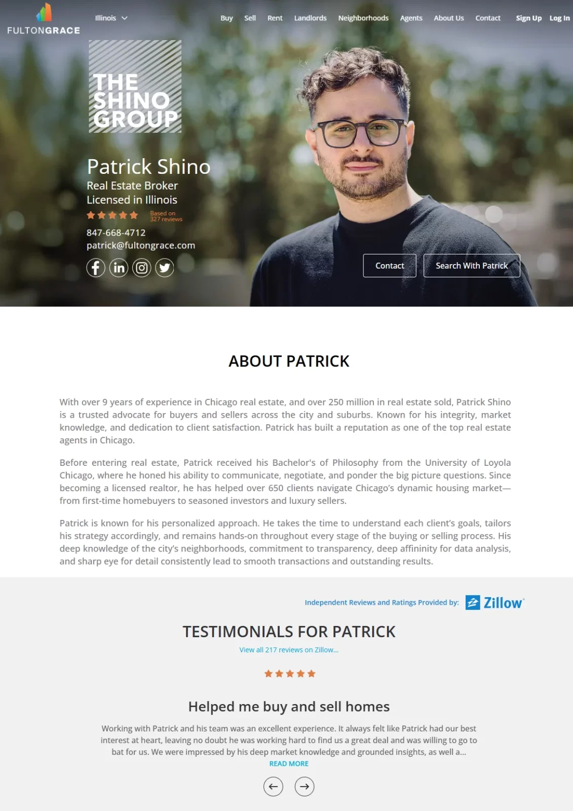
This page is all about the featured agent. The focus is on his story, experience, and client testimonials, so the website visitors can get a sense of who they’d be working with.
If you scroll down, you’ll also find Patric’s active property listings, so the page connects personal branding with real opportunities. Social media network links are included for anyone who wants to learn more or follow his updates.
>> More on social media tips: 25 Expert Social Media Tips for Real Estate Agents
Testimonials from Zillow reinforce the agent’s credibility and show visitors he delivers real results. Clear CTAs like Contact and (our favourite!) Search With Patrick buttons give clear next steps.
What works well:
- High-quality hero image
- Strong credibility markers
- Clear CTAs visible right away
- Personal story that builds trust
What could be improved:
- Important details in the bio could be bolded for quicker scanning
2. Cove Capital Investments: Landing pages for ads
Cove Capital’s landing page is a strong example of an ad-driven experience. A Google search ad for ‘investment opportunities New Jersey’ appears at the top of the results.
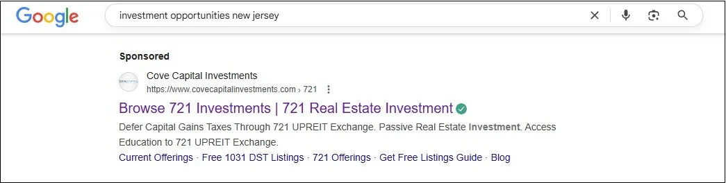
When clicked, it leads directly to a page promoting the ‘721 Exchange strategy.’
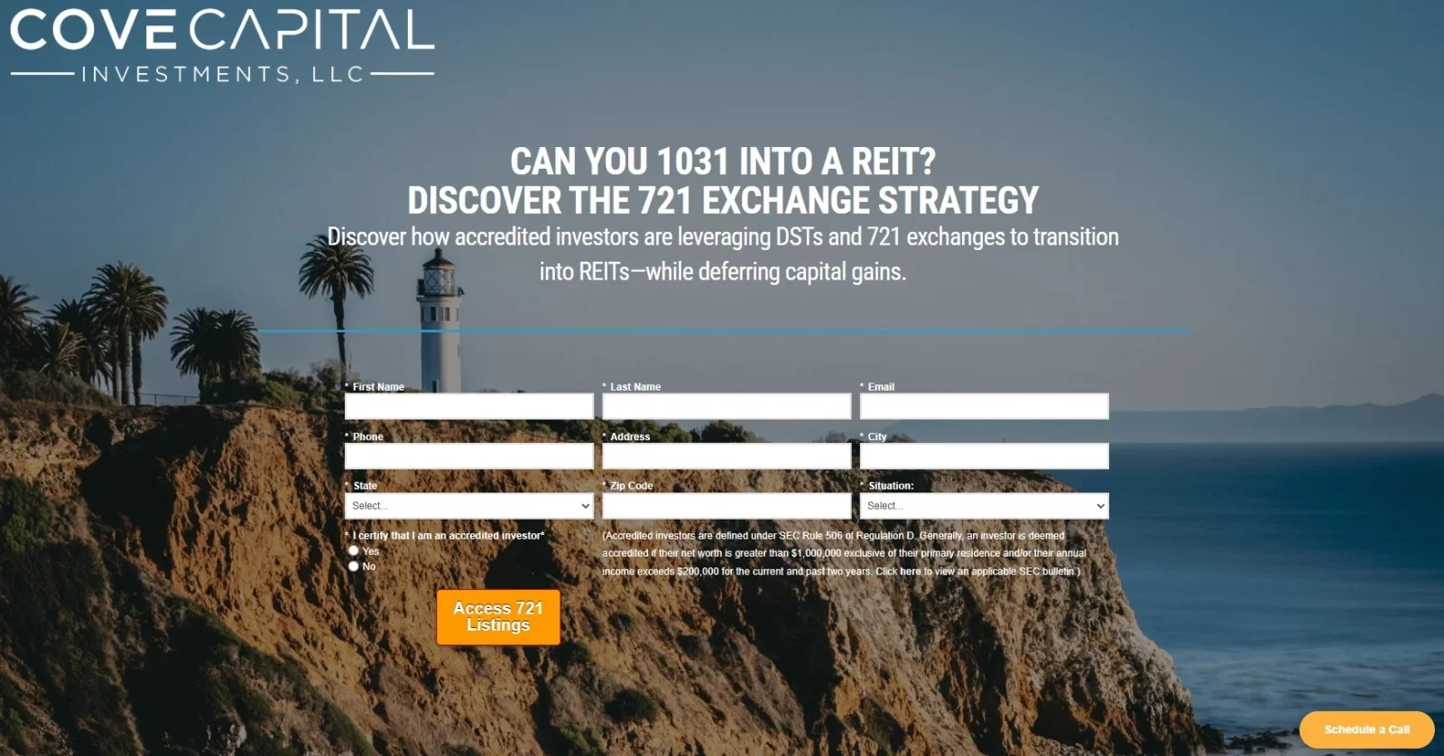
The message between the ad and landing page is consistent, which helps build trust and reduce friction. There are no distractions here–no navigation menus or extra links. The page immediately presents a detailed form and clear CTAs, encouraging visitors to access listings or schedule a call.
What works well:
- Strong message match between ad and landing page
- Clear and visible CTAs
- Professional, visually appealing design that builds authority
What could be improved:
- The lead capture form is long and may discourage completions
3. Dave Perry Miller: Landing pages for open houses
This real estate landing page is designed for buyers looking for open house opportunities. A potential client might click a link in an email newsletter or a targeted ad and arrive here to see all upcoming events in one place.
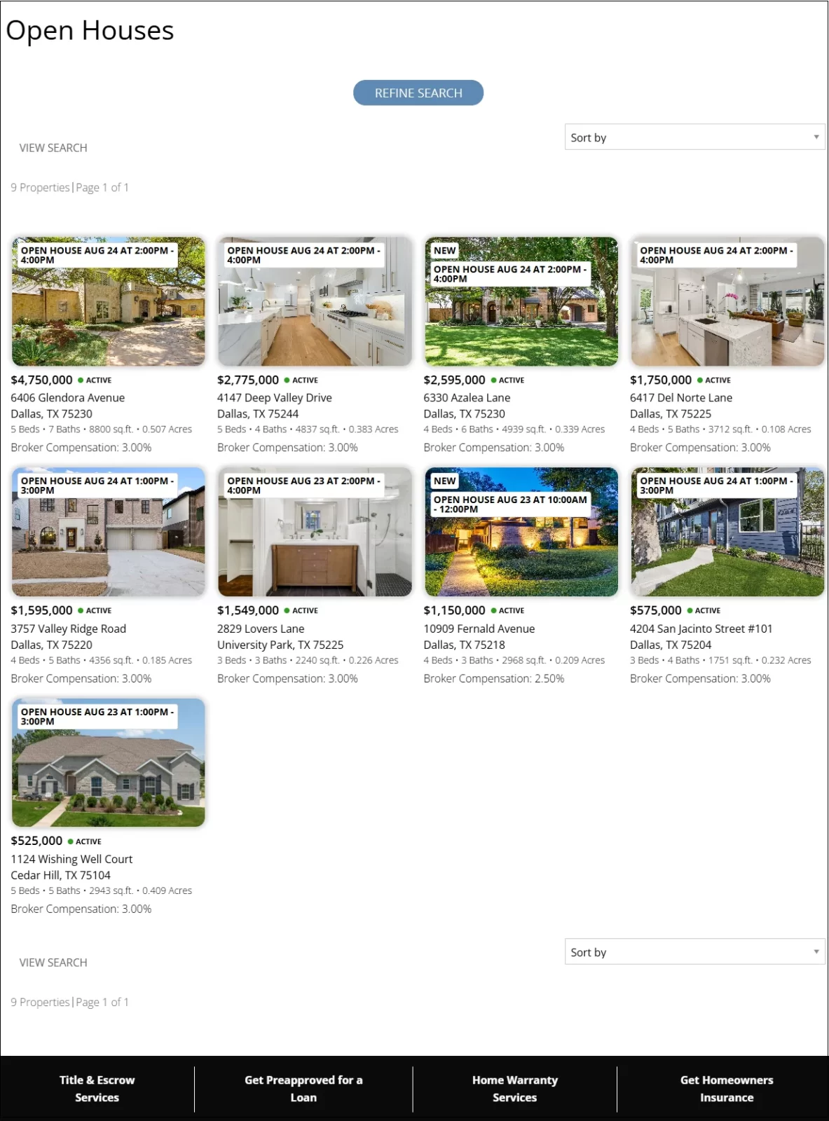
The grid layout makes it easy to scan listings at a glance, with open house times, prices, and photos shown right away. Visitors can refine their search without leaving the page, which keeps the focus on attending an event.
What works well:
- Strong headline
- Easy-to-browse grid layout with times, prices, and photos
- Simple filtering to refine search
What could be improved:
- The footer is heavy and distracts from the main listings
- Adding a sticky main call to action, like Get Open House Alerts could improve lead capture
4. Property Sellwise: Home valuation landing page
Property Sellwise’s real estate landing page gets straight to the point: helping homeowners quickly see what their house could be worth. The bold headline ‘Sell Your House Fast’ immediately tells potential sellers what they’ll get.
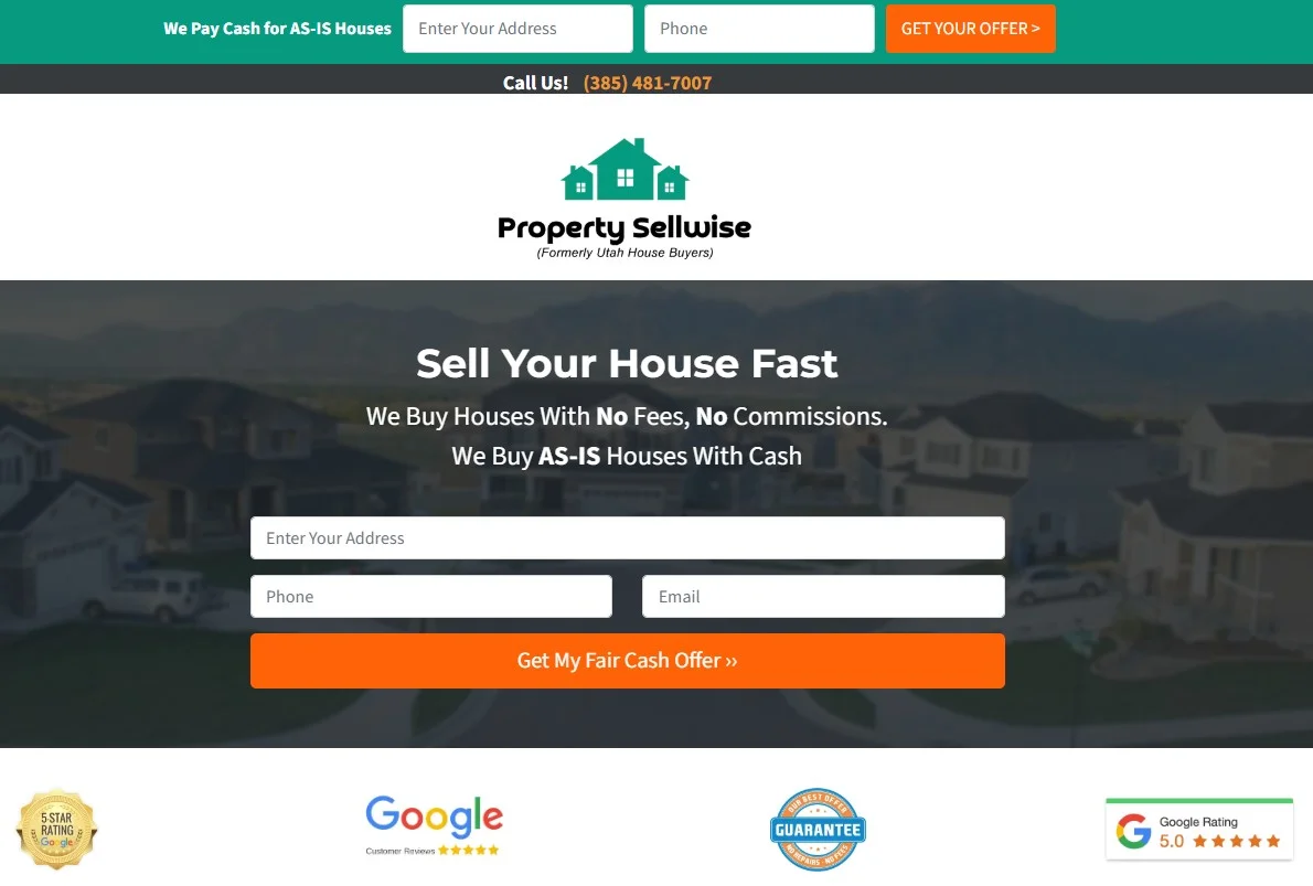
The form on this landing page is placed right at the top, making it impossible to miss. It only asks for the essentials: property address, phone, and email, which keeps the process quick and easy.
Trust is reinforced with Google reviews, badges, and a guarantee icon, which reassure homeowners they’re dealing with a credible buyer. The bright orange CTA button stands out against the page, making the next step obvious.
What works well:
- Simple, benefit-driven headline
- Short, easy-to-complete form
- Strong trust signals
What could be improved:
- Add a short line explaining when or how fast the homeowner will get their offer
5. Starboard CRE: Appointment booking landing page
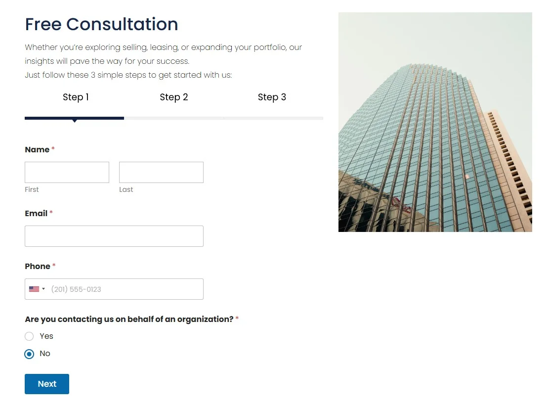
Starboard CRE keeps things professional with a clean three-step form to book a free consultation. It’s clear, focused, and signals they want to work with serious clients ready to take action. This example comes from clicking on a Google ad, but the same setup works perfectly for other campaigns too.
Another thing you can do to encourage appointment bookings is to use a scheduling tool like Calendly. For instance, Ruth Krishnan makes it easy for prospects to pick a time directly from her email:
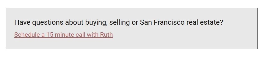
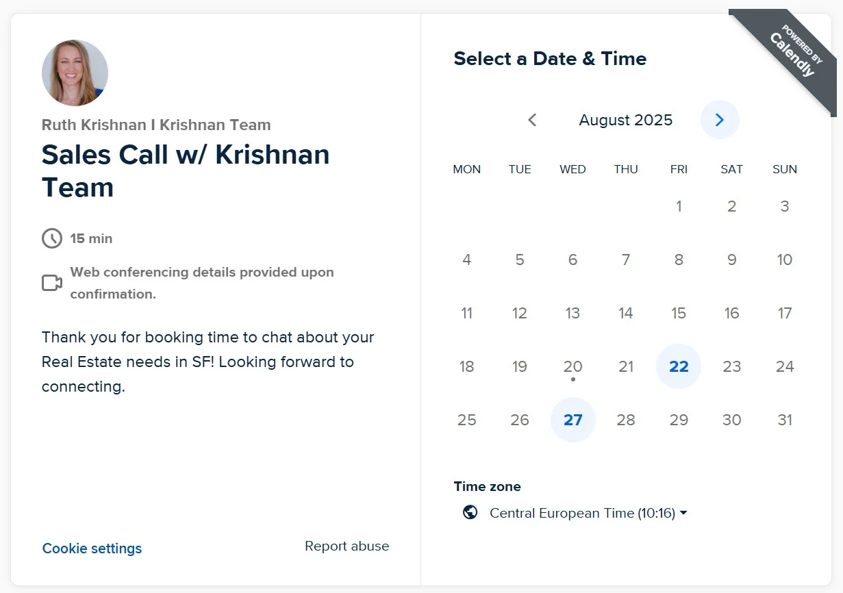
and book a 15-minute call without back-and-forth:
Here’s one more expert tip: You can show third-party widgets, like Calendly, anywhere on your Placester website through Zapier integration to make appointment booking super easy for clients. With the codeless builder, you can place it on your real estate landing page, agent bio, or any other page in minutes.
6. Robin Abraham: Property listing landing page
For real estate agents and brokers, the property listing landing page is one of the most important pieces of their website. It’s often the first touchpoint where prospective buyers seriously consider a property.
And that moment is the chance to capture their interest.
Robin Abraham’s page checks these boxes. Plenty of the listing photos, price, and key details are displayed front and center, while the ‘Request Showing’ button makes it easy to act.
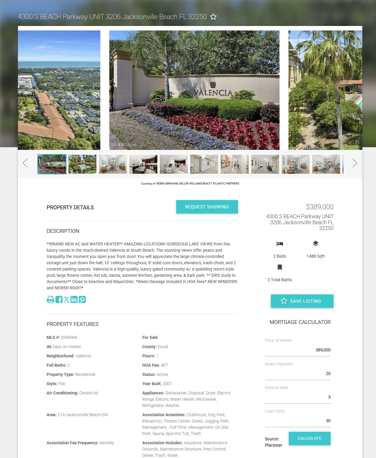
Extra touches like the mortgage calculator from Placester (bottom right in the screenshot) and the save listing option above it, make the experience more convenient for buyers. The built-in contact form then keeps the conversation flowing directly with the agent.
What works well:
- Immediately visible key property details
- High-quality images
- Easy to spot CTA buttons
- Helpful extras like the mortgage calculator and save option
- Contact form at the bottom
What could be improved:
- Adding short video testimonials or agent credibility markers
>> You may also be interested in: How to Become a Luxury Real Estate Agent? 6 Steps Guide
7. PNW Realty LLC: Free resource landing pages
Free resource pages, often called squeeze pages, are one of the most effective ways to build your email list. PNW Realty LLC does this well with a handy report offering.
The page headline immediately taps into one of the biggest homeowner wonders – ’How much is my home really worth?’
The simple first step only asks for the property address. It’s low effort and encourages quick engagement.
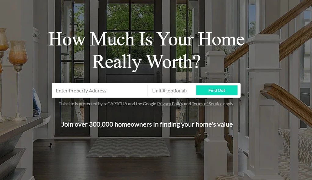
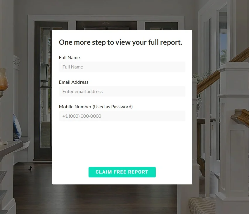
Once submitted, users see a follow-up form asking for their name, email, and phone number to unlock the report. This two-step approach works because it gets people engaged early, making them more likely to complete the second step.
Besides reports, you can use free resource real estate landing pages to offer:
➡️ Neighborhood guides
➡️ Financing guides
➡️ Industry reports
➡️ Checklists for first-time buyers
➡️ Buying and selling process guides
➡️ Moving checklists
➡️ Investment insights
➡️ Home staging tips
The key is giving away something genuinely useful in exchange for contact info.
What works well:
- Strong, curiosity-driven headline that speaks directly to homeowners
- Low-friction first step (address only) pulls visitors in
- Clean, modern design with a clear CTA button
- Social proof boosts credibility
What could be improved:
- Adding a short explainer about what’s inside the report could increase perceived value and encourage completions
8. Equity Colorado Real Estate: Recruitment landing page
For brokerages, a recruitment landing page can be just as important as a property listing or valuation page. You want the best agents in your team, and the real estate landing page is where the candidates form their first impression of your culture and support system.
Equity Colorado Real Estate’s page hits the right notes by combining agent testimonials with a clear invitation to schedule a private consultation.
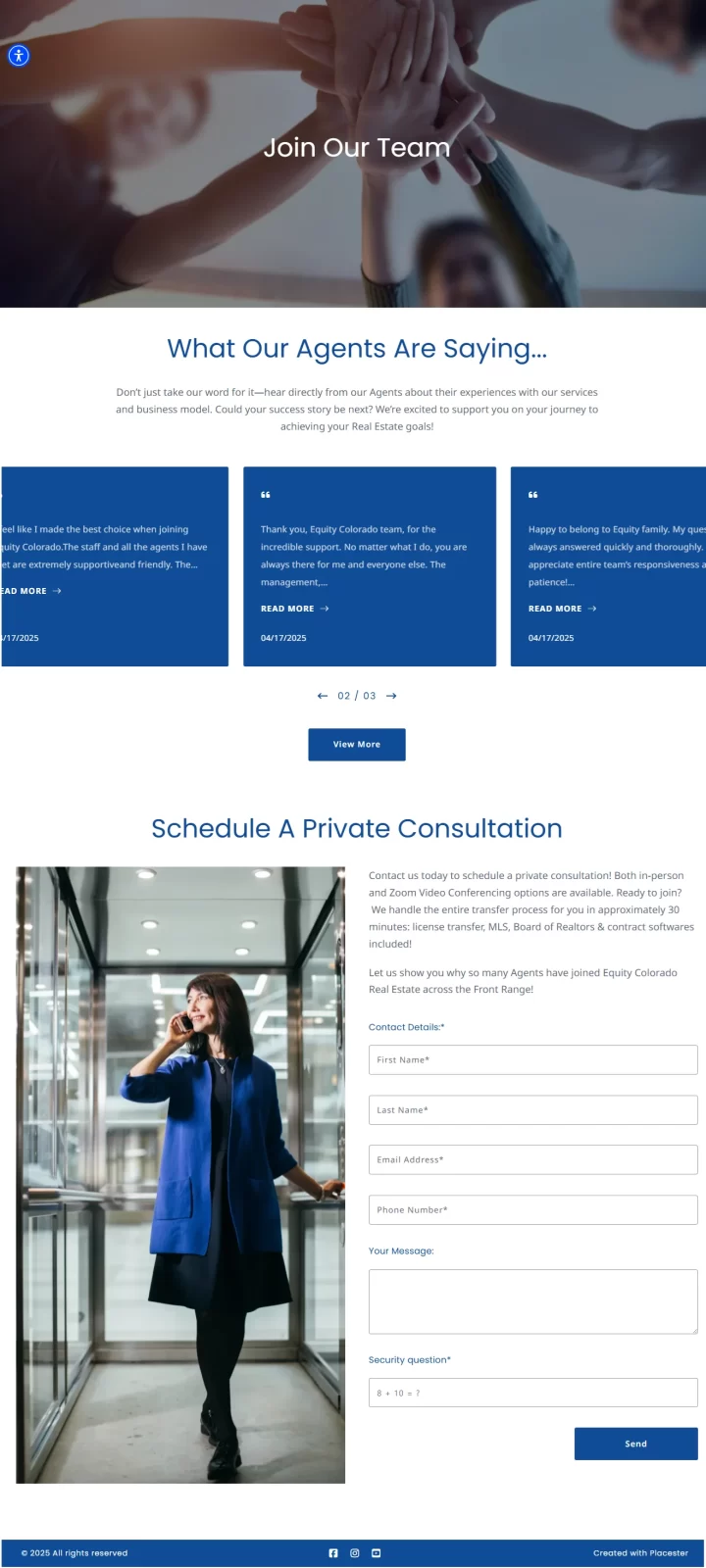
On this page, hearing directly from other agents and realtors builds credibility, so it’s always worth adding this form of social proof.
Then there’s the form, which makes the next step easy, letting prospects schedule a consultation either in person or over Zoom.
The copy highlights fast onboarding, which reduces barriers for agents considering a switch. This practical detail works as a strong differentiator.
What works well:
- Minimalistic design
- Agent testimonials
- Fast onboarding promise
What could be improved:
- The long form may discourage some candidates
9. MaxxCity Homes: Neighborhood discovery landing page
MaxxCity Realty’s Space Coast Neighborhood Explorer takes a different approach from a traditional property-search or listing page. Instead of asking visitors to start with a specific property, it encourages them to find the right community first. The page features 46 Space Coast communities, each with information such as median prices, school ratings, lifestyle characteristics, and current listings.
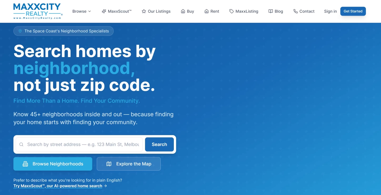
The experience is particularly useful for buyers who know the general area where they want to live but aren’t sure which neighborhood is the best fit.
Visitors can explore communities by characteristics such as beachfront, waterfront, walkability, golf, new construction, luxury, or affordability, and then move from a neighborhood profile to available properties.
What works well:
- Focuses on the neighborhood and lifestyle, rather than just individual properties
- Clear progression from exploring a community to finding a home
- Useful information such as prices, schools, walkability, and market trends
- Lifestyle tags make it easy to identify neighborhoods based on personal preferences
- Combines neighborhood information with actual property listings, keeping the experience connected to the buying journey
What could be improved:
- The amount of information available for each neighborhood could potentially feel overwhelming for visitors who are just beginning their search
- Adding more visual content, such as neighborhood photography, videos, or short local guides, could make the experience feel more immersive
10. Candlewood Apartments: Interactive apartment finder landing page
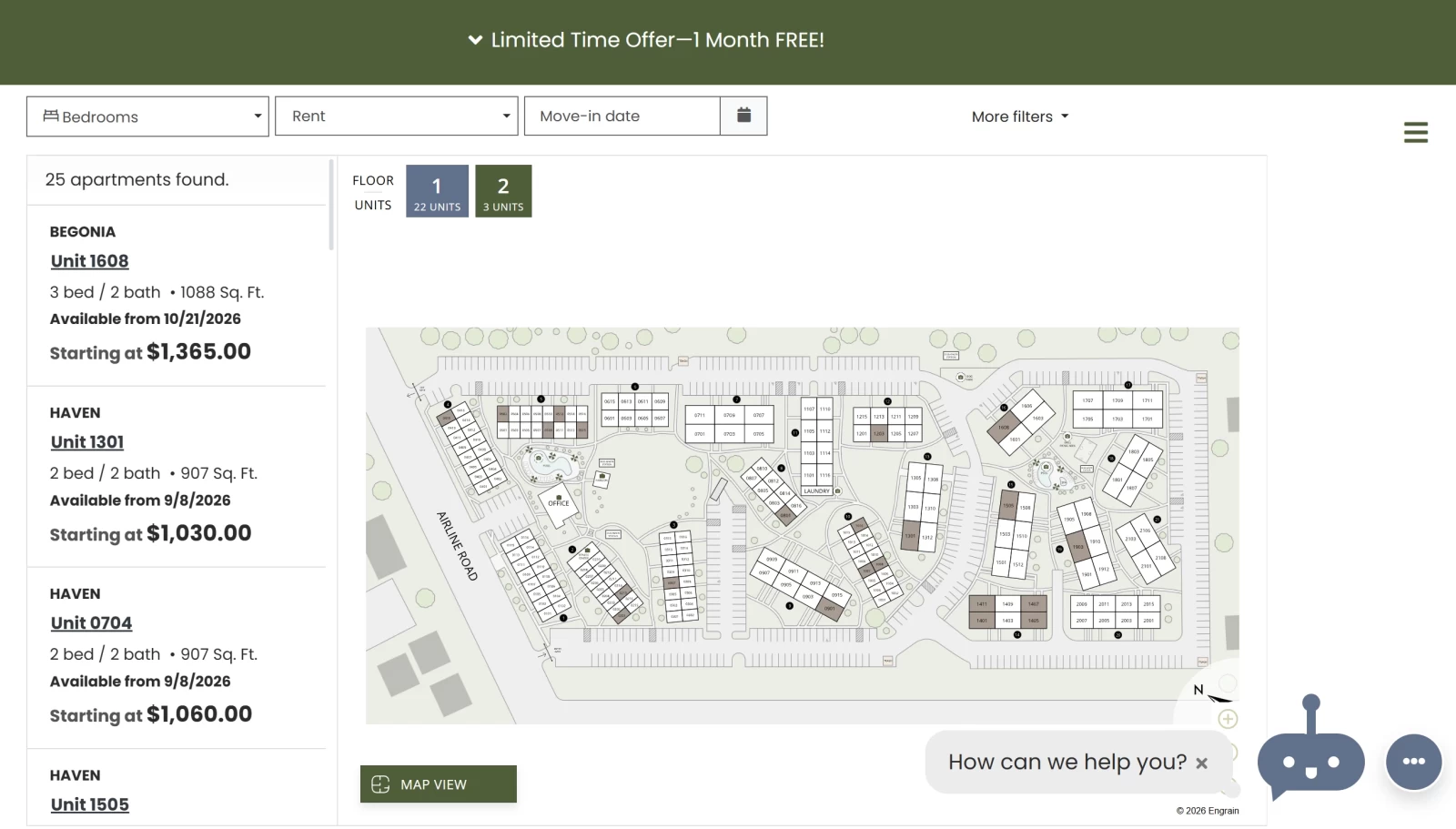
Candlewood Apartments has a landing page dedicated specifically to apartment hunting—DIY way.
Its Interactive Unit Selection page gives prospective renters a hands-on way to browse available apartments and find a unit that matches their preferences. Instead of scrolling through a standard list of floor plans, visitors can use filters to narrow down apartments by bedrooms, bathrooms, rent, square footage, move-in date, and specific amenities such as a fireplace, pool view, first-floor location, or upgraded finishes.
Available units are displayed with key details including floor plans, size, availability dates, starting prices, and amenities. Once visitors find an apartment they like, they can take the next step directly from the page by applying, scheduling a tour, or contacting the leasing team.
What works well:
- Highly interactive and self-service experience
- Extensive filters make it easy to narrow down available units
- Key information such as price, size, availability, and amenities is easy to access
- Individual units can be explored through their floor plans and images
- Clear conversion options such as Apply Now and Schedule a tour
What could be improved:
- The large number of filters and available units may feel somewhat overwhelming for first-time visitors
- A stronger introductory section explaining how the interactive tool works could make the experience easier to navigate
- Adding more lifestyle-oriented content alongside the functional apartment finder could help visitors connect emotionally with the property before choosing a unit
7 steps to create a high-converting real estate landing page [RESEARCH BASED]
Now that we’ve established why landing pages matter and what good real estate landing pages look like… How do you actually build one that works?
Here’s a list of 7 solid, science-backed steps—based on the article “Landing Pages Features to Attract Customers” by Ioana Teodorescu and Viorel Vasile, published in the “Ovidius” University Annals, Economic Sciences Series.
It’s a very comprehensive overview of the design and psychological principles that can influence how visitors respond to a landing page. The authors look at both the practical elements of a landing page—such as headlines, copy, CTAs, visuals, and trust signals—and the psychological factors that can influence visitors’ decisions.
This is how you can implement those rules to make your own landing page:
Step 1: Start with a single, focused message
A landing page should have one clear purpose and one main message.
Avoid giving visitors too many competing options or asking them to take several different actions. The paper argues that when consumers are faced with multiple choices, making a decision becomes more difficult, so the page should stay focused on the specific goal of the campaign.
Step 2: Craft a compelling headline and engaging copy
Landing-page copy should be easy to understand and concise, with a single clear message rather than long blocks of unnecessary information.
Your real estate landing page should always match the promise that brought the visitor there. If someone clicks an ad offering a free, instant home valuation, the page must deliver exactly that.
Start with a clear headline that reassures visitors they’re in the right place. Keep your body copy short, focus on benefits, and use bullet points, so readers can quickly scan the text and see what’s in it for them.
If writing isn’t your strength, use AI tools for real estate, like a copy generator. Smart tools help you write multiple headlines and copy variations fast. You can then test which ones resonate most with your audience.
💡Need inspiration? Check out this article with the best ChatGPT prompts for real estate agents.
Step 3: Use visuals strategically
Images aren’t just there to make the page look better.
They can help direct attention and reinforce the message. The paper discusses the “gaze” effect, for example: when an image shows a person looking toward a particular element, visitors tend to follow their gaze.
Supporting images or videos can help communicate the offer and guide attention to important parts of the page.
Step 4: Know your goal
But first, you need to determine your one goal (the ultimate one) and target audience.
Are you trying to power seller lead generation?
Or is building a bigger sphere of investors your aim?
Knowing this will help you decide which type of real estate landing page will work best, which elements to include, and what copywriting to focus on.
If you’re looking to create a property landing page, we’ve put together a brief video showing how to build and duplicate pages in Placester. The process is quick and simple, so you can have new landing pages up and running in just a few clicks.
Step 5: Focus on benefits, not just features
Don’t simply describe what the product or service offers.
Explain how those features help the customer and what problem they solve. The paper recommends addressing questions visitors are likely to have about things such as quality, price, features, benefits, and reassurance.
Maslow’s hierarchy of needs helps to create landing pages according to the emotional needs of visitors. Basic needs are related to survival, so prospects become motivated when reading about product features.
– Ioana Teodorescu, Viorel Vasile
Step 6: Implement a lead capture form with a clear call-to-action
The fewer fields you ask for, the more likely visitors are to complete the form. Stick to the essentials like name, email, and phone number.
If you’re offering something valuable, like a home valuation, market report, or buyer’s guide, make that clear right next to the form.
Your CTA should use strong action words that match the offer. For example: ‘Get My Home Value‘ or ‘Download Free Guide.’
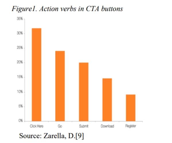
In fact, the aforementioned article “Landing Pages’ Features to Attract Customers” highlights several action-oriented words and phrases that can encourage visitors to take the next step, with some appearing more frequently in effective CTAs than others:
Another effective website design practice is to use a button color that contrasts with the rest of the page. This way, the visitor’s attention is drawn to it right away, instantly signaling where to click.
Step 7: Add trust signals
People want proof before sharing their details. Here’s what you can do:
- Show your face – add a professional headshot or team photo to make the page more personal.
- Include real estate testimonials – short quotes with names and photos if possible.
- Highlight stats – number of homes sold, years of experience, or average days on market.
- Use third-party trust markers – reviews from Zillow, Google, or badges like Realtor® membership.
The impact of social proof is connected to herd behavior, a psychological phenomenon when individuals gather to act collectively. This influence is created when landing page boosts credibility and trust.
– Ioana Teodorescu, Viorel Vasile
Need more inspiration?
Check out this video from Kyle Handy, one of the top US realtors and a market expert, whose real estate YouTube channel is full of tips on how to use technology to upgrade your business.
How To Create Your Own Real Estate Landing Page (Plus 15 Examples)
5 tips for optimizing a real estate landing page that doesn’t convert
Let’s say you did build a great landing page using the tips above but… Somehow, it doesn’t really perform as you imagined.
What now?
You’re not doomed yet, as there are obviously some optimizing techniques that you can implement to transform the LP from a low-performing one to a converting machine.
Here are our best 5 tactics and tips to follow for landing page optimization (in real estate and beyond):
1. Check for technical and usability issues
Sometimes a landing page doesn’t convert because there’s nothing fundamentally wrong with the offer or copy — the page is simply frustrating to use.
Slow loading, broken forms, tiny text, difficult-to-tap buttons, or a page that doesn’t work properly on mobile can cause visitors to leave before they even have a chance to consider the offer.
Before changing your messaging or redesigning the page, check things like:
- Does the page load quickly enough?
- Does everything work properly on mobile?
- Is the form easy to use on a phone?
- Are buttons large enough and easy to tap?
- Are images or videos slowing the page down?
- Are there any broken elements or technical errors?
These issues may seem minor, but they can have a significant impact on whether someone stays on the page long enough to convert.
2. Find the biggest drop-off before changing the page
If a landing page isn’t converting, first look at where people are abandoning, rather than assuming the whole page is the problem.
Analytics can tell you where users drop off, but usability research shows it often can’t tell you why. Baymard’s extensive usability research makes this distinction explicitly: behavioral data identifies symptoms, while user testing is needed to uncover the underlying friction.
Practical takeaway: Look at metrics such as:
- landing-page bounce/engagement
- scroll depth
- CTA clicks
- form starts vs. completions
- conversion rate by traffic source/device
- the exact step/field where users abandon
Then investigate the weakest point rather than blindly changing the entire page.
3. Test hypotheses instead of making random design changes
This is probably the most important principle for an existing landing page.
Don’t do:
“The page isn’t converting → let’s change the headline, colors, images, CTA, layout, and form.”
You’ll have no idea what actually helped.
Instead:
Identify a problem → form a hypothesis → make one meaningful change → measure the result.
For example:
Observation: Lots of visitors reach the form, but few complete it.
Hypothesis: The form feels too demanding.
Test: Remove three non-essential fields.
Measure: Form completion and final conversion rate.
Or:
Observation: Visitors engage with the page but don’t click the CTA.
Hypothesis: The offer isn’t sufficiently clear/value-oriented.
Test: Rewrite the headline and CTA around the specific benefit.
Measure: CTA click-through and conversion rate.
This turns CRO from “make the page prettier” into an actual evidence-based optimization process.
4. Make the CTA (next step) even clearer/easier
You’d think it’s obvious what you want a visitor on your website to do. But that’s because you’ve spent countless hours trying to decide what each step is supposed to mean.
For a random person who spends a few seconds on a webpage—and yes, people really do spend only 52 to 54 seconds on a single page—the myriad of pop-ups and listing photos and contact forms can make it difficult to instinctively go to that next step.
That’s why you should always make sure that each landing page has a clear-cut CTA that communicates the action and, ideally, what will happen when the visitor clicks it — especially if the action involves submitting personal information or starting a multi-step process.
Instead of asking yourself only “Is the CTA visible?”, ask:
- Do I immediately know what this button does?
- Does the wording describe the next step clearly?
- Is there one obvious primary action?
- Am I asking visitors to do more than necessary?
- Do I know what will happen after I click?
The goal isn’t necessarily to make the process as short as possible. It’s to remove uncertainty and unnecessary effort so that once someone decides they want the offer, taking action feels straightforward.
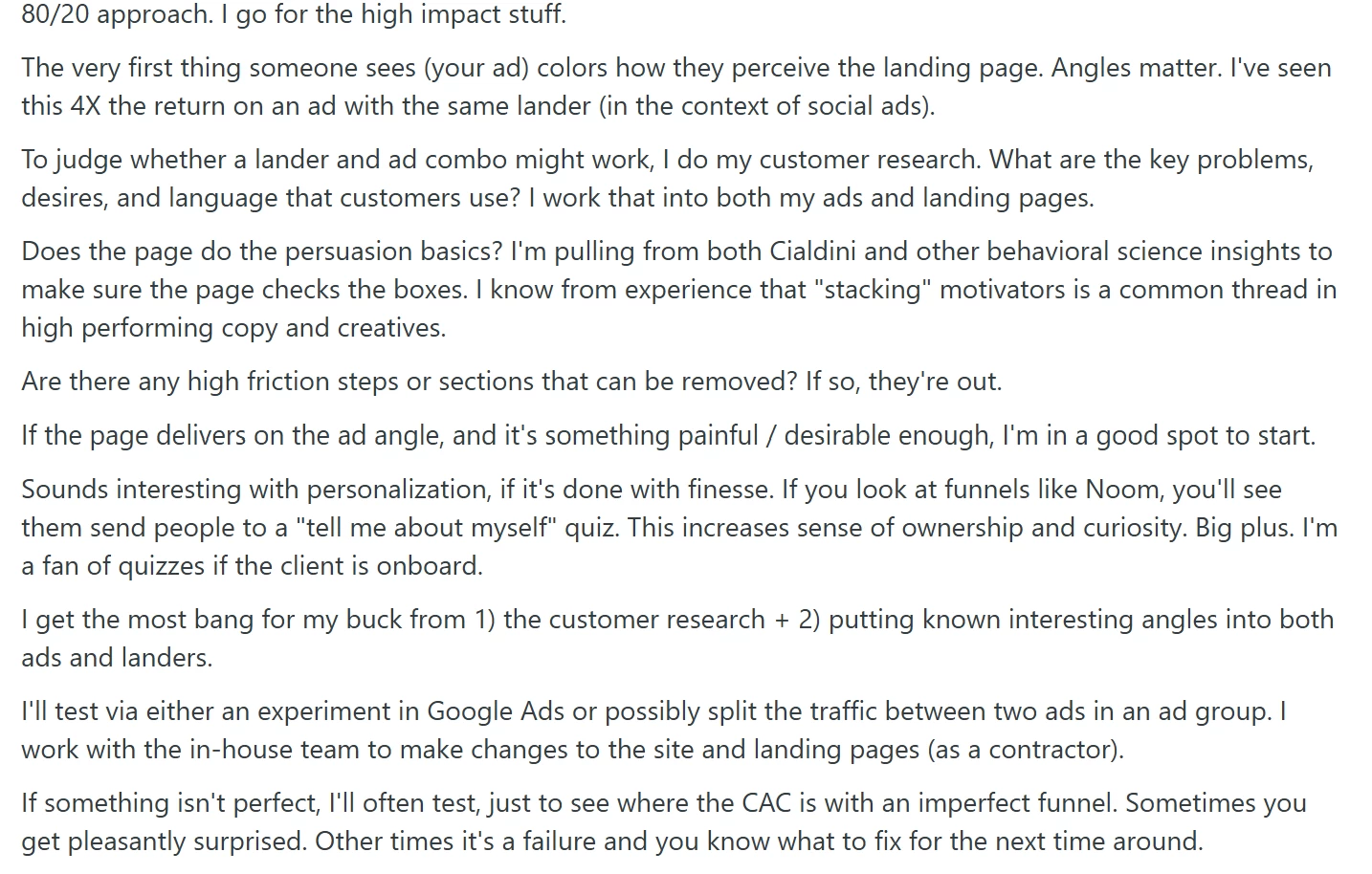
5. Use the 80/20 rule, e.g., start with the highest-impact variables
This one is Reddit-inspired, but bear with us, as it doesn’t make it any less credible.
The main idea is to focus on the things that are most likely to make a big difference, instead of trying to improve every little part of the landing page. Before tweaking button colors or rewriting individual lines of copy, look at the parts of the funnel that can fundamentally change conversion performance.
Start by understanding your customers—what they want, what problems they have, and how they talk about those problems—and use that information in both your ads and landing page.
The page should reinforce the promise or angle that attracted the visitor in the first place while giving them compelling reasons to take action. At the same time, look for unnecessary steps, content, or other sources of friction that could make conversion needlessly difficult.
Here’s the original Reddit advice for reference:
Key takeaways
There are millions of real estate landing pages you can build, depending on the goal you want to achieve. With the right toolset, you can design pages that consistently bring results in just minutes.
One of the easiest ways to build landing pages for real estate leads is to use a website platform with built-in templates. Ensure your software is armed enough for SEO challenges and allows you to automate as much as possible while maintaining quality. Some tools even include writing and design support to help you create customizable pages. Placester is one of them!
If you’re ready to take the next step, sign up for a free trial today.
FAQ
Are landing pages still relevant?
Yes. Landing pages are still one of the most effective ways to turn traffic into qualified leads, showcase properties, or promote resources. In real estate, they’re often the first step to turning online interest into inquiries and conversations.
What is average cost of a landing page?
With a website builder from Placester, real estate landing pages designed to convert are included in your plan, so you don’t pay extra per page. A custom-built option, on the other hand, can range from a few hundred dollars to much more, depending on design and features.
What is best real estate landing page builder?
The best real estate landing page builder is built specifically for this niche. Placester lets you create landing pages, like property pages, home’s valuation forms, and lead capture pages, without code, all tailored to agents and brokers.
Published on


Take your real estate website to the next level with Placester!
Discover new opportunities and save thousands of dollars every year.