")


Real estate website design has become increasingly sophisticated as marketers find innovative ways to grab the attention of viewers and communicate effectively online. From bold graphics to unique navigational schemes, real estate website designers are constantly devising new ways to take advantage of the web’s interactive possibilities.
We’ve compiled a list of twenty-four sites that represent the best of what’s new in real estate website design. Even if you aren’t a web designer, or an agent looking to create a new real estate website, the “curb appeal” of these designs make them worth a look.
(The examples listed below are not Placester customers unless otherwise noted.)
Scot Karp, Premier Estate Properties

From top to bottom, Karp’s real estate website design is nearly flawless. It features all of the core components needed to supply site visitors with the information they want, whether they’re just doing research or are interested in specific listings: social sharing buttons at the very top of the page, a prominent real estate search bar above the fold (the portion of a web page that’s visible without having to scroll), appealing neighborhood and listing photos, and plenty of copy detailing Karp’s value proposition and his market.
Houlihan Lawrence

As one would expect looking at a real estate website from a Christie’s International Real Estate brokerage, Houlihan Lawrence’s is impeccable. No muss, no fuss: Just the basics featured in an elegant, clean layout. The scrolling slideshow below the navigation bar allows visitors to scroll through one beautiful property after another, while the “Featured Community” section beneath it offers visitors a glimpse into one of the niche markets the firm serves, including housing data for that particular area. All in all, an exemplary website design.
Ginger Martin and Co.

In the same vein as Houlihan Lawrence, the real estate website design for California-based Ginger Martin and Co., a Sotheby’s International Realty brokerage, is simple yet effective. Whether you want to investigate properties in and around Napa and Sonoma Valley, get info on the firm’s buying and selling value, or check out some of the company’s informative real estate blog posts, you can easily find each resource.
Slifer Smith and Frampton Real Estate

Crisp and concise perfectly describe the homepage for Slifer Smith and Frampton Real Estate’s website. All of the essential search tools are above the fold — along with appealing imagery of the Vail Valley, Colorado area. Additionally, real estate website visitors can access other vital resources to aid their buying and selling experiences, including a local housing market analysis, information on moving services, real estate videos detailing the local lifestyle, and a property alert sign-up. The map at the bottom of the page showing where the agency’s offices are located statewide is especially a nice touch. You won’t find many better real estate website designs than this.
EWM Realty International

Full-bleed images as part of a real estate website design is a relatively new fad among industry pros. These photos provide a sleek aesthetic for websites and can captivate visitors (assuming the full-bleed image is an attractive one, like a listing photo of a luxury property). EWM takes advantage of this website trend with a slideshow featuring some amazing interiors and exteriors of its listings and its microsite “Lifestyle of South Florida” magazine. Below the fold are all of the other important facets real estate websites need to thrive: open house info, social sharing buttons, blog post links, and other unique real estate marketing collateral for users to consume.
CORE NYC

Including lots of social proof on your real estate website is a guaranteed way to get visitors to stick around longer — something New York–based agency CORE knows well. Noting its designation as the top real estate brokerage in Manhattan in a big, bold font atop its homepage, the firm instantly instills trust in its audience. The symmetrical, easily navigable layout of the rest of the page is stunning. Scroll down and you see one dazzling feature after another. Moreover, the wealth of white space on the page works wonderfully for CORE’s design. (If you’re a fan of minimal layouts like this one, check out this post from web design education company Treehouse on how to use whitespace appropriately).
Edler Group

Another example of full-bleed imagery used well comes from Edler Group. In addition to showcasing its premier listings up top, the firm makes sure to provide numerous others along with the specific neighborhoods and communities where those listings are available — in other words, everything a prospective buyer needs to conduct thorough research of the local market. Despite the ample examples of homes for sale, the real estate website design isn’t bogged down or overcrowded.
The Goodhart Group

Showing off your listings is clearly a prime avenue to take with your real estate website design, but exhibiting the agents selling and buyers purchasing those listings can be powerful as well. For instance, The Goodhart Group displays its hard-working agents and those purchasing the residences it represents — another valuable form of social proof. Aside from that, everything on the homepage is evenly spaced and clearly identifiable, making the site a great one in terms of user interface and experience, both of which are very important.
The Force Realty

To get the best real estate website design, you need to get with the times. The Force Realty understands this, as it has an HTML5 real estate website. This is a type of markup language for websites that allows for unique graphics and designs (and of equal importance, Google appears to be a fan of HTML5 sites). It may seem like a small thing to have graphical elements like those on this firm’s real estate website, but they can help create a strong UX that improves your visitors’ time on site and capture leads effectively. (If you want to see more examples of HTML5 sites, take a look at this post from Creative Bloq.)
The Jills

Yet another example of agents using whitespace wisely. Hetzberg and Eber have one of the foremost easy-on-the-eyes real estate websites out there today. Three other notable qualities that make it stand out from the pack are its comprehensive search function positioned right in the middle of the homepage, The Jills’ detailed agent bios, and the numerous widgets along the right side of the page that link to their core pages — press mentions, their blog, local retail info, luxury rental details, and much more. Of course, it doesn’t hurt that the broker duo are branding experts and clearly know how to make the most of their real estate website design.
DeLeon Realty

Short or small doesn’t mean substandard. Take DeLeon Realty’s homepage, for example: It may not include every last business detail or a plethora of listings, but it’s still a very efficient (and search-optimized) real estate website design. The logo and navigation atop the homepage are clearly laid out. The featured listing pops off the page, while the featured neighborhood and promotional video off to the right stand out as well. And the social proof below helps reinforce the agency’s great publicity. The real estate website homepage is minimalism at its finest.
Central Park Real Estate

Though it’s debatable if this website is the most SEO-friendly one, it’s undoubtedly a nifty real estate website design. The intent for appeal is clearly the upper-echelon buyers of Manhattan, meaning the firm’s website needs to attract that high-end audience. This intuitive design is certainly an ideal way to do just that. Scroll over each building and you get the info on every unit available. The rest of CPRE’s webpages are equally impressive. Squat New York, the real estate website designers behind the firm’s site, did an immaculate job crafting a distinct UX for luxury shoppers in the Big Apple. (Just looking at it makes you want to learn how to design a real estate website, right?)
Amanda Howard Real Estate

On the other end of the spectrum of the aforementioned short real estate websites are longer ones, like this one from Amanda Howard Real Estate. The multiple photo views above the fold and substantial search bar make for a straightforward UX, while the new, popular, and featured listings give visitors plenty to peruse off the bat. Adding in vibrant imagery for the background only bolsters this already superbly constructed real estate website design.
Riskin Associates

This HTML5 wonder is the total package. Well-spaced images and text allow for clearly discernible branding and functional elements, like the video listings and “about us” pages at the bottom. Riskin’s real estate website design is one you never get bored looking at — definitely a quality every agent should aspire to achieve with their sites.
Nancy Batchelor Team

As is the case with every aspect of your business, organization is key, and that extends to your real estate website design. Notice the neatly organized block links near the bottom of Nancy Batchelor Team’s homepage: The photos for each link are very eye-catching. Add in the blog and listing block links below it, the featured listing at the top, and the exhaustive company info right in between, and you’ve got a well-balanced real estate website.
Sue Adler

A change of pace from sites we’ve already mentioned, but nonetheless an equally practical and successful real estate website design. This site from Sue Adler Team favors function over style. Having said that, it’s certainly a modern-looking real estate website and does the job — that is, it offer buyers all they need to perform thorough home searches and access all of the pertinent details about the firm’s business.
The Engel Group

The real estate blog, client testimonials, detailed search function, business background info, recently added listings — all of the real estate website essentials are prominently featured on The Engel Group’s site, thanks in large part to a stellar design. The agency closes the deal, so to speak, by using a soft color palette and professional-looking font style to create an appealing user experience.
The Lanier Property Group
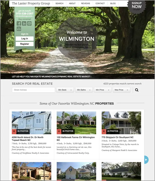
Boutique firm The Lanier Property Group adds personal touches to its real estate website, designating spots for its favorite listings and blog posts about the Wilmington community. Its clear-cut navigation bar along the top of the homepage, and multiple search fields and lead-capture forms, make the site one for other agents to mimic.
Carol McGraw

Visitors of Carol McGraw’s real estate website can find everything they need to know about the metro San Diego housing market in minutes by navigating the undemanding, simple layout. Though there isn’t a search feature on the homepage, that doesn’t mean buyers can’t locate homes for sale of interest — the core markets McGraw operates in are linked throughout the homepage, making it a cinch for buyers to pinpoint relevant properties.
Stribling & Associates

“Elegant” is the first word to come to mind when examining Stringling & Associate’s real estate website design — which means the company’s real estate marketing is right on target, given its core audience of luxury consumers. The agency’s New York City–based niche markets are represented well on the homepage, while the firm offers industry insights in an educational video and its live Twitter stream at the bottom of the page. Arguably the most impressive part of the site is the “about us” page, where the company tells its story in style.
Nest Realty

Brokerages with multiples offices in multiple locations often benefit from having a real estate website dedicated to explaining what each group of agents offers consumers. If this fits your brokerage’s description, you’re well off taking a page from Nest Realty’s book. Six hefty-sized images represent each of the company’s six locations, allowing buyers to identify which markets to research. Consider this real estate website design an ideal one to point consumers in the right direction.
Maximum Exposure Real Estate

Go big or go home: A philosophy Massachusetts Realtor Bill Gassett adopts for his real estate website design. His blog posts, market reports, listing links, and value prop (along with just about anything else you could ever want to know about his firm) take up the majority of the screen. No, there aren’t any flashy elements or a scrolling photo slideshow, but Gassett has what he needs to succeed on his site. Take one look at it and it’s evident he’s a highly engaged agent who cares about how visitors access his company info — and is determined to turn those visitors into real estate leads.
The Agency

It’s only fitting a real estate agency from Hollywood has one of the more cinematic-esque real estate websites. Aside from featuring photos of SoCal’s best homes for sale, the firm gets right to the point with what it wants visitors to achieve: signing up for its email newsletter, accessing its blog posts, and finding the right office and agent to fill their buying needs. As the saying goes, sometimes less is more, and that couldn’t be truer here.
Reilly Realtors

Showing off tech-savviness, relatability, and comprehensive listings and business information to consumers can go a long way in helping you secure more leads. Reilly Realtors hits the trifecta with its real estate website, the design of which is clean and effective. The white-and-orange aesthetic fits the firm’s branding, while showing off testimonials and the design’s responsive capabilities across the homepage, along with clickable agent photos that lead to each respective bio page. Overall, an all-star example of website design for real estate.
Download our Next-Level Website Elements guide to discover how to improve your site design.
![]()